Bibby's Kitchen @ 36 Logo Design
OPS designed the logo and website theme for the recently launched food blog Bibby’s Kitchen @ 36. Dianne Bibby runs cooking classes, and the food blog was a natural extension of this.
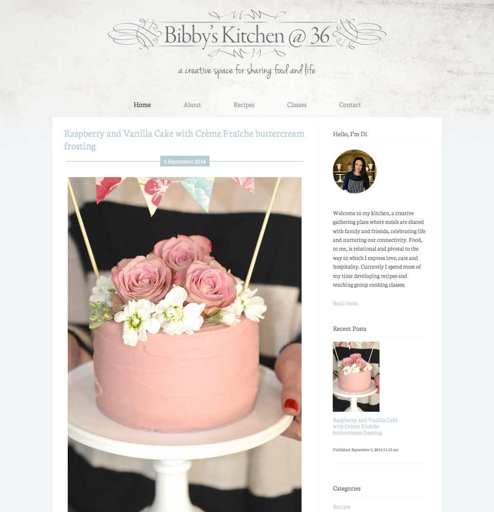
The logo features elegant and restrained lines to give the logo a refined look-and-feel, and the casual appearance slogan below invites the website’s visitors to feel at home and relaxed.
The logo is displayed in a slate grey colour, which is still highly legible, but doesn’t have any of the hardness of a solid black.

The website theme features a subdued palette of colours that allows the food to shine through - as the seasons change and the photographs go from light and airy summer shots, to darker, more earthy shots in winter, the website continues to provide the perfect backdrop to present the concept.
Visit the website to see the theme and logo in action at bibbyskitchenat36.com

