Brough Leadership Institute Website

The andrewbrough.com website has been up and running for several years, but with the change of company name from Andrew Brough Communications to Brough Leadership Institute, we realized a change in strategy was required for Andy's web presence.
OPS created a slick new website theme that uses wide, clean, expansive views of the content BLI provides, offset with strong colour and image choices.
We also separated the websites for Dr Andrew Brough from the Brough Leadership Institute, so that the two can stand together but separate, allowing Andy the ability to separate content and branding for the Brough Leadership Institute and his own personal brand.
The websites are all fully responsive so that they will display correctly on mobile devices, and avoid getting a penalty in Google Search results (Non mobile-friendly websites now appear lower down in search results as opposed to those that are mobile friendly).
The websites both make extensive use of grid layouts to present the content, which allows a familiar and easy way to browse the various sections of the websites.
The web presence refresh follows the recent design of brand-new business cards for Dr Andy Brough - read more about those here.

A large, image rich presentation of the core concepts of BLI take centre stage on the homepage.
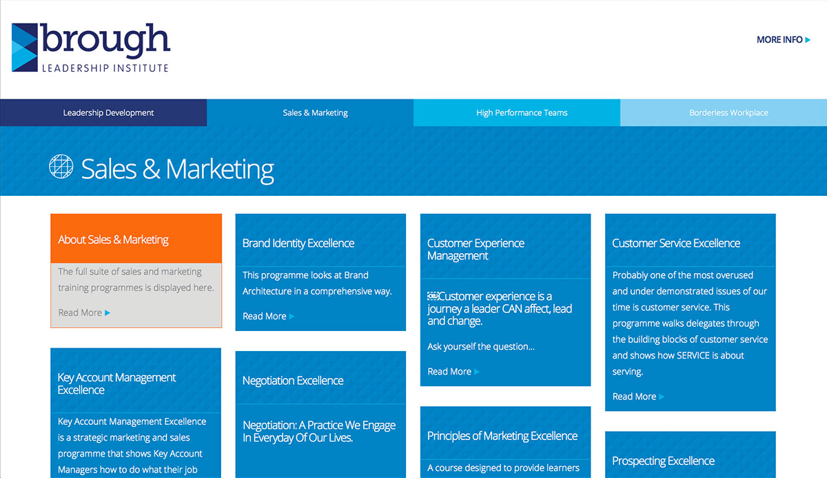
Grid layouts provide the fastest way for visitors to assess the volume of content presented on the website.
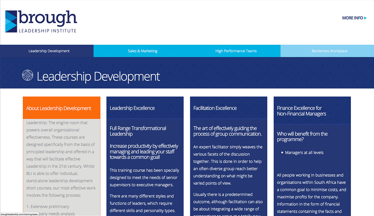
Each of the main 4 core sections is assigned a key colour and pattern to create cohesion.
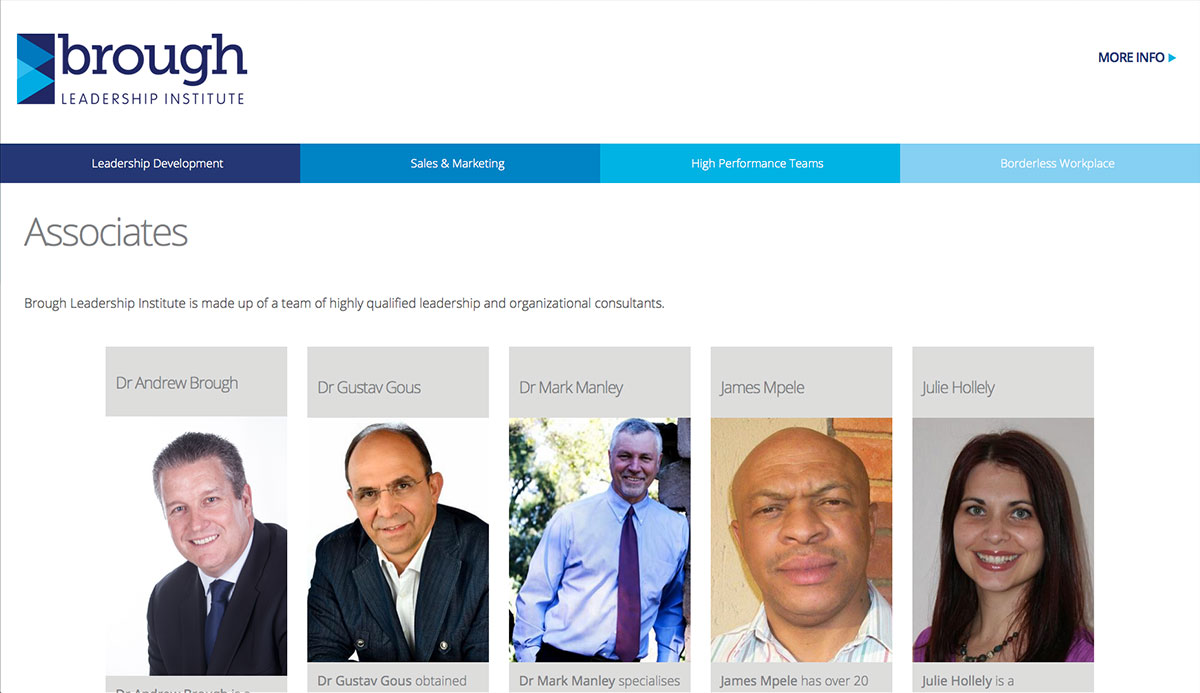
Grid layouts are used to present the associates along with an intro to each person, along with a link to view their full resumé.
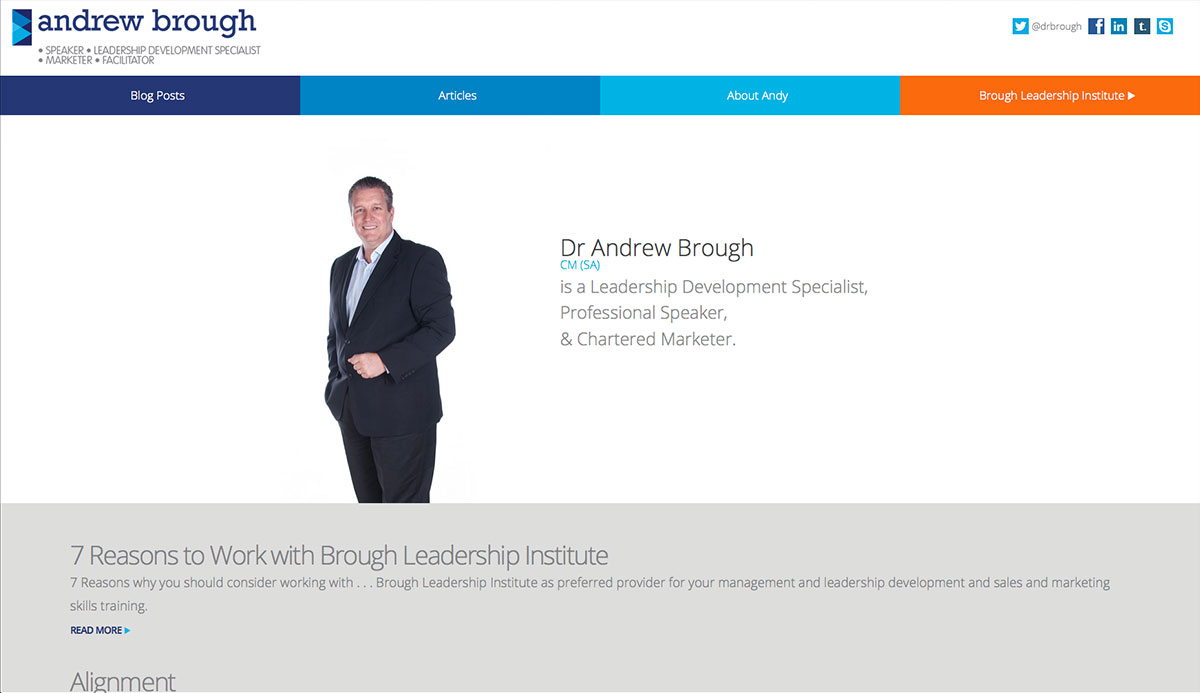
The AndrewBrough.com website takes a similar theme to the BLI site, but the focus is on Andrew Brough himself, and the content he creates in his personal capacity.
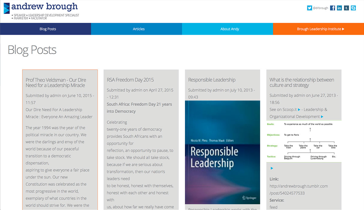
Blog posts are pulled in automatically from Dr Andrew Brough's Tumblr blog.
- Log in to post comments
