Prestige Solutions Logo Refresh
Prestige logo header
The logo for Prestige Solutions was conveying the core concept of the company well - the fact that the company sits in the centre of three core spheres of operation - but the logo was looking dated. One Part Scissors created a logo with a flat modern style, while still maintaining the strong links to the previous logo to ensure that the new identity is very much an evolution from the current corporate image, rather than a radical departure that would alienate the client base and destroy years of accumulated value in the brand.
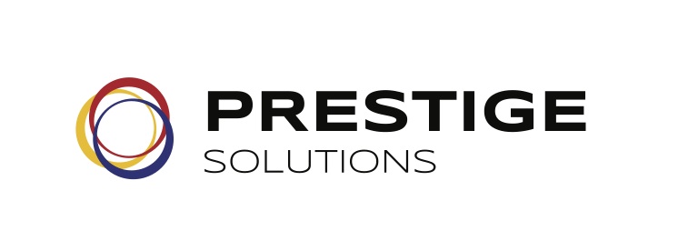
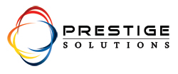
Prestige logoImage

New Prestige Logo vs Old Prestige Logo


(Meta)Canonical URL: 

Although we ensure the websites we build for our clients are compatible with all browsers, we like to push the envelope on our own website. So we've made the decision to make use of a design that looks amazing in all browsers... except Internet Explorer. If you're still using IE, you need to change - the web has moved on from Internet Explorer, and you will get a safer, faster, and more enjoyable experience out of the Internet if you use anything other than IE. Have a look at BrowseHappy.com to choose a new browser. We recommend Google Chrome and Firefox.

(PS: Microsoft is working on a new web browser, and we're all holding thumbs that it will follow the web standards and display the web like everyone else does... correctly.)