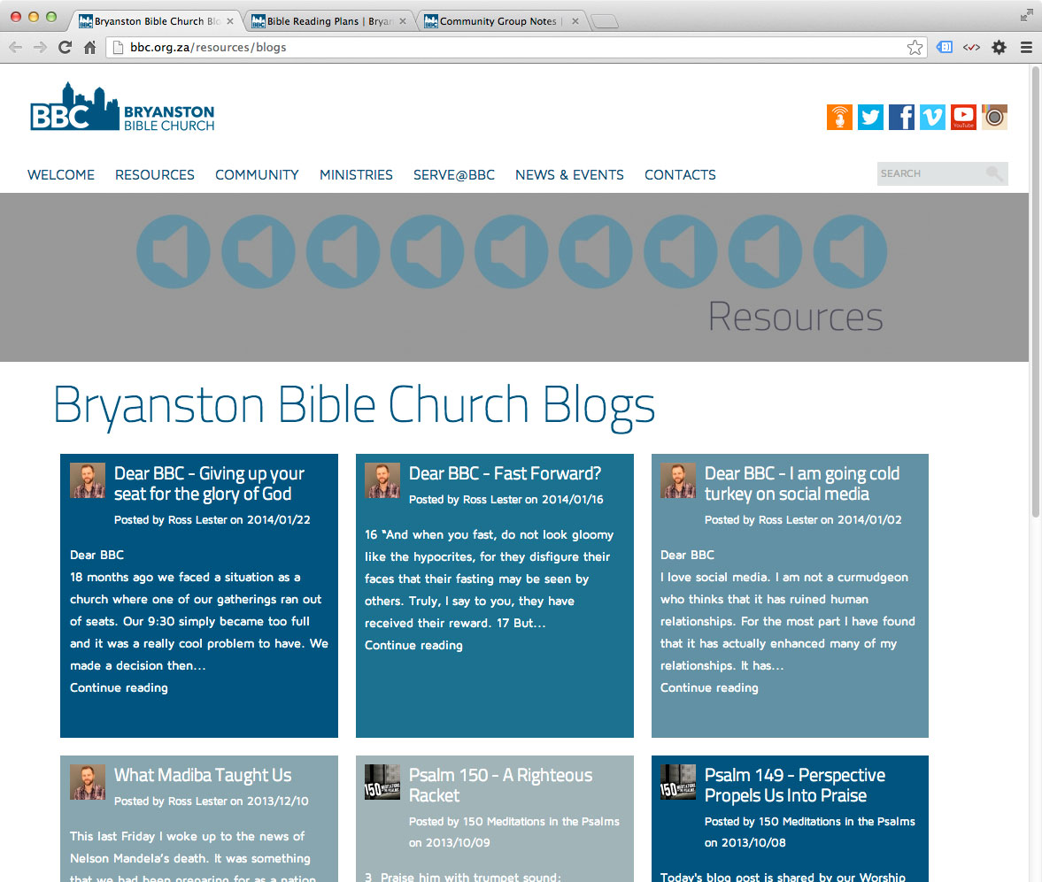
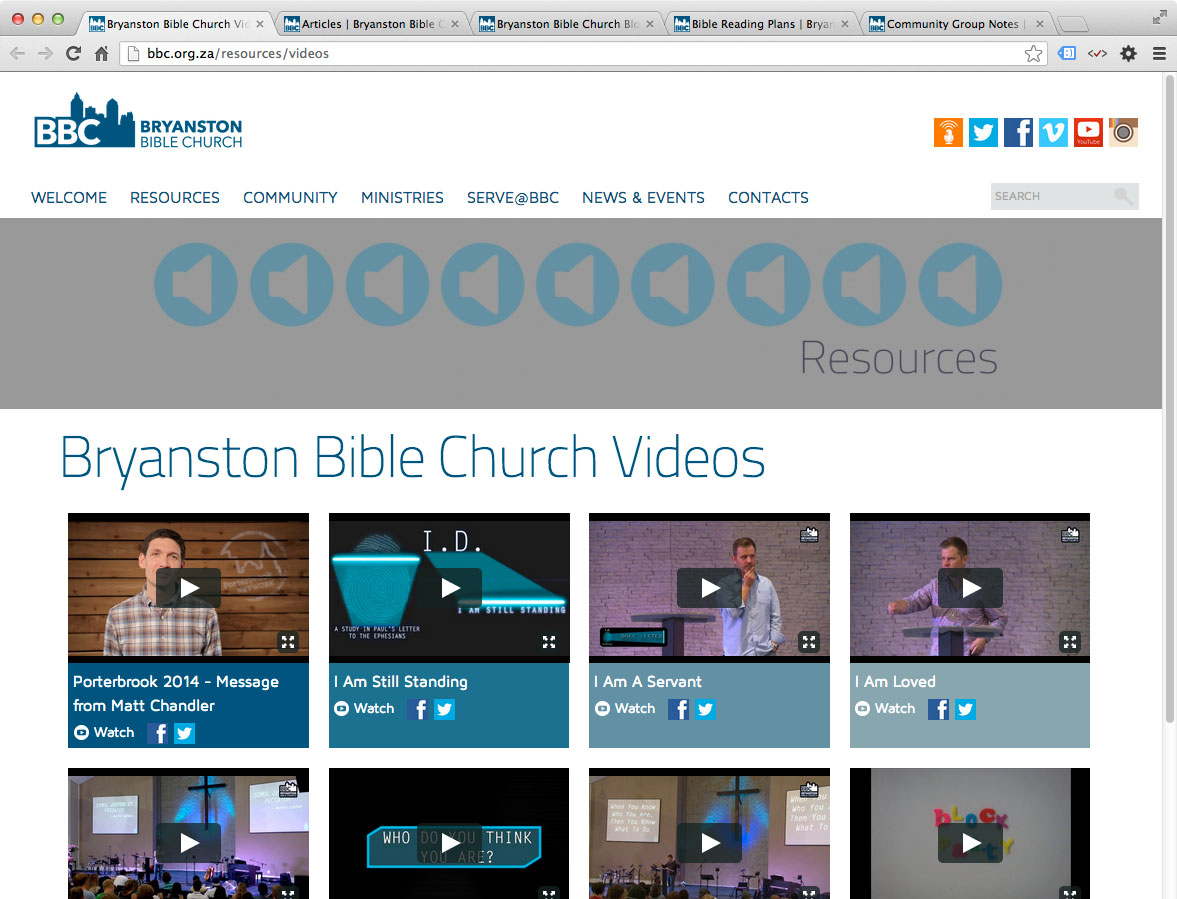
Bryanston Bible Church Website Refresh
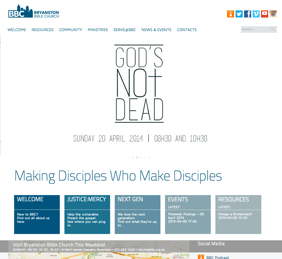
OPS has refreshed the Bryanston Bible Church website with a slick, clean, new theme that presents the content using a more polished and simplified approach.
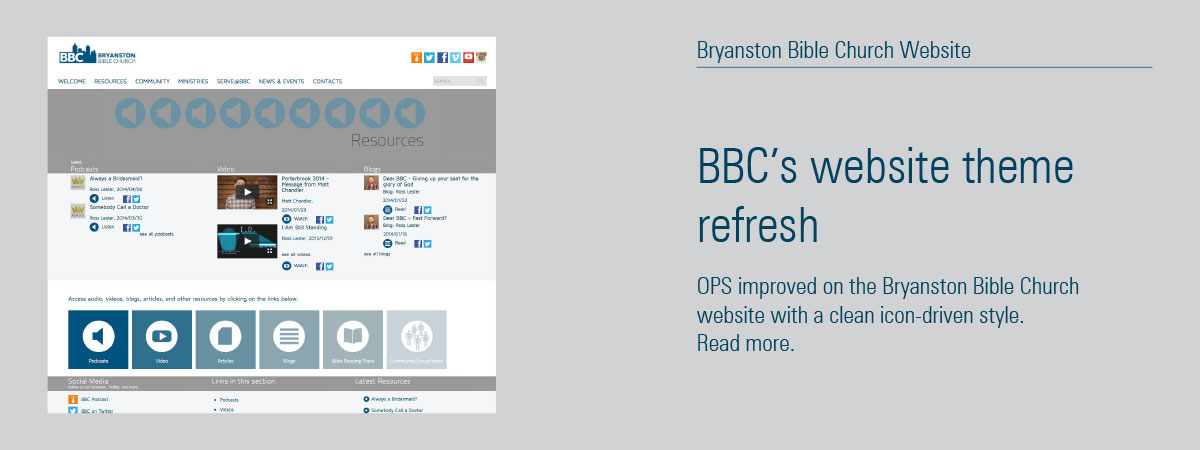
The new website theme is built on top of the existing Drupal platform, making the implementation of a new theme a quicker project than an entire website redesign.
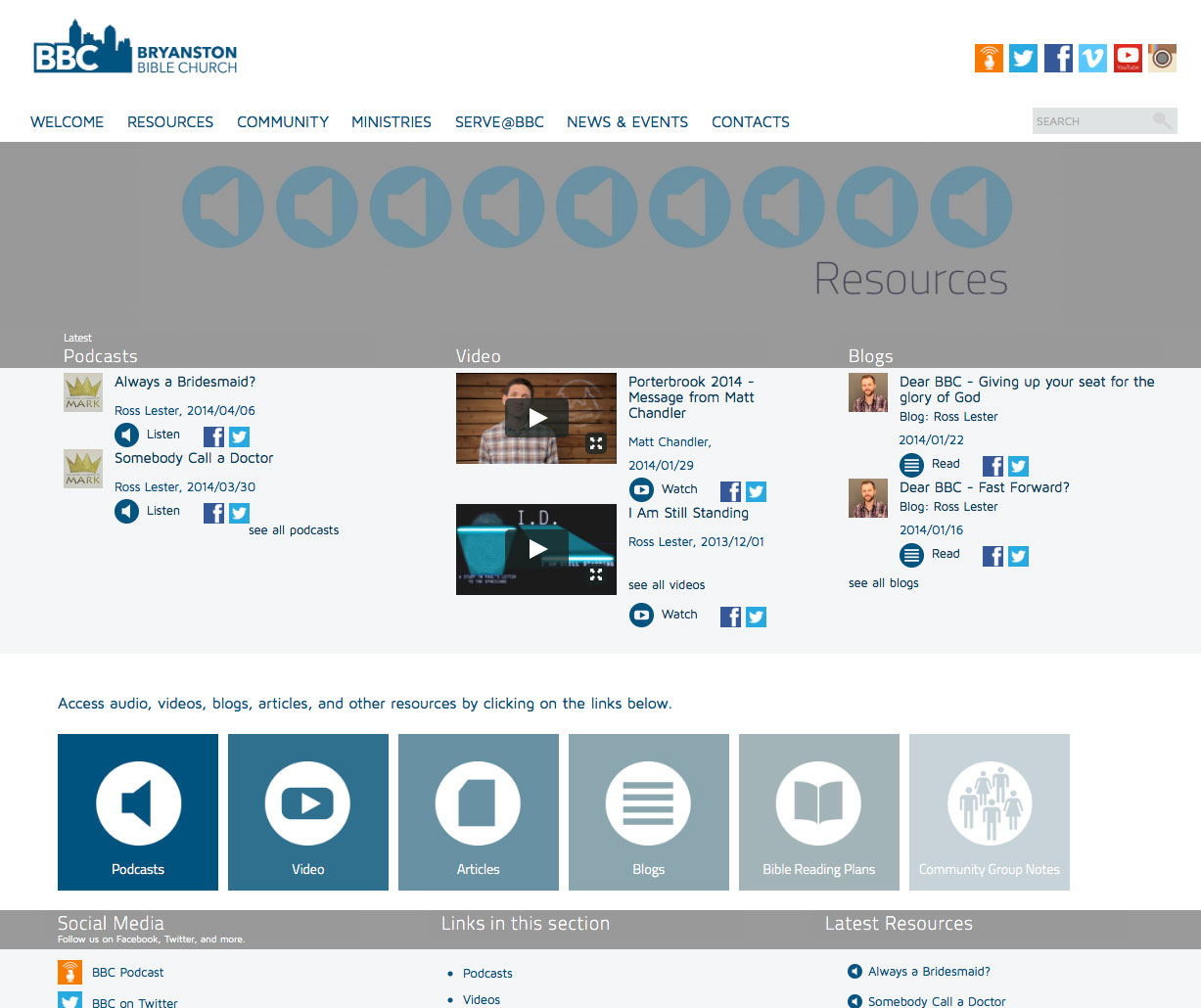
The new theme makes use of icons to provide a cleaner presentation of the content - the users of the website are now comfortable with the conventions used on the website, allowing us to replace long, wordy, links with small simple symbols. The overall effect is a fresher, more spacious website that is more approachable.
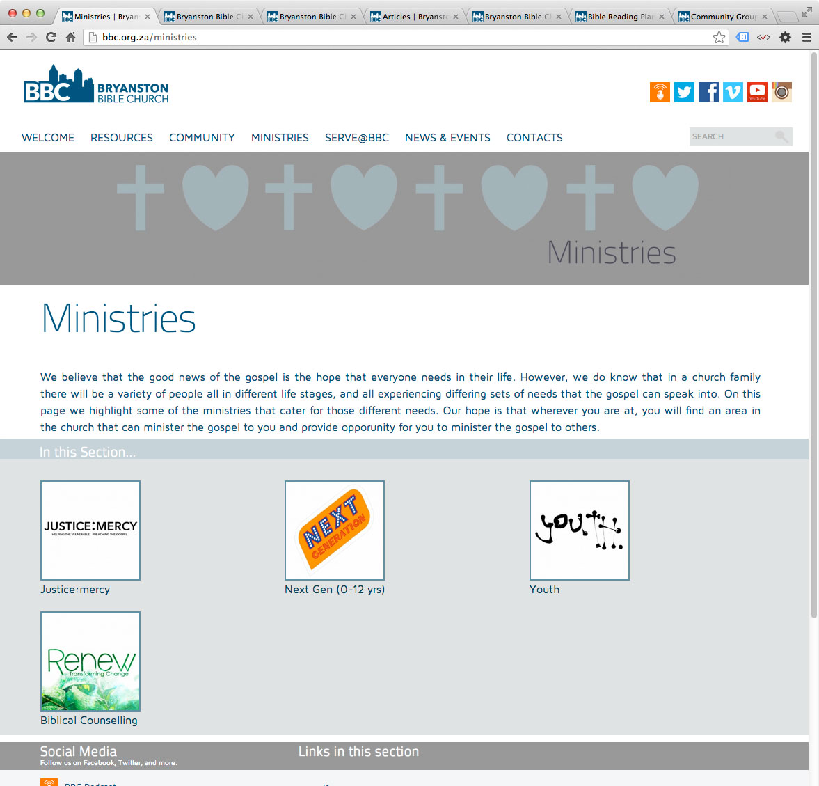
One of the key challenges OPS identified with the website before the refresh was the number of text-heavy pages. The frontpage was graphical and engaging, but once a visitor delved further, pages all looked very generic and bland. The solution to this problem was to create a new type of 'landing page' that BBC can easily create to introduce a section of the website, and present the sub-pages in a more graphical way, without requiring the skills of a web designer for page layout - the website's theme does the work automatically.
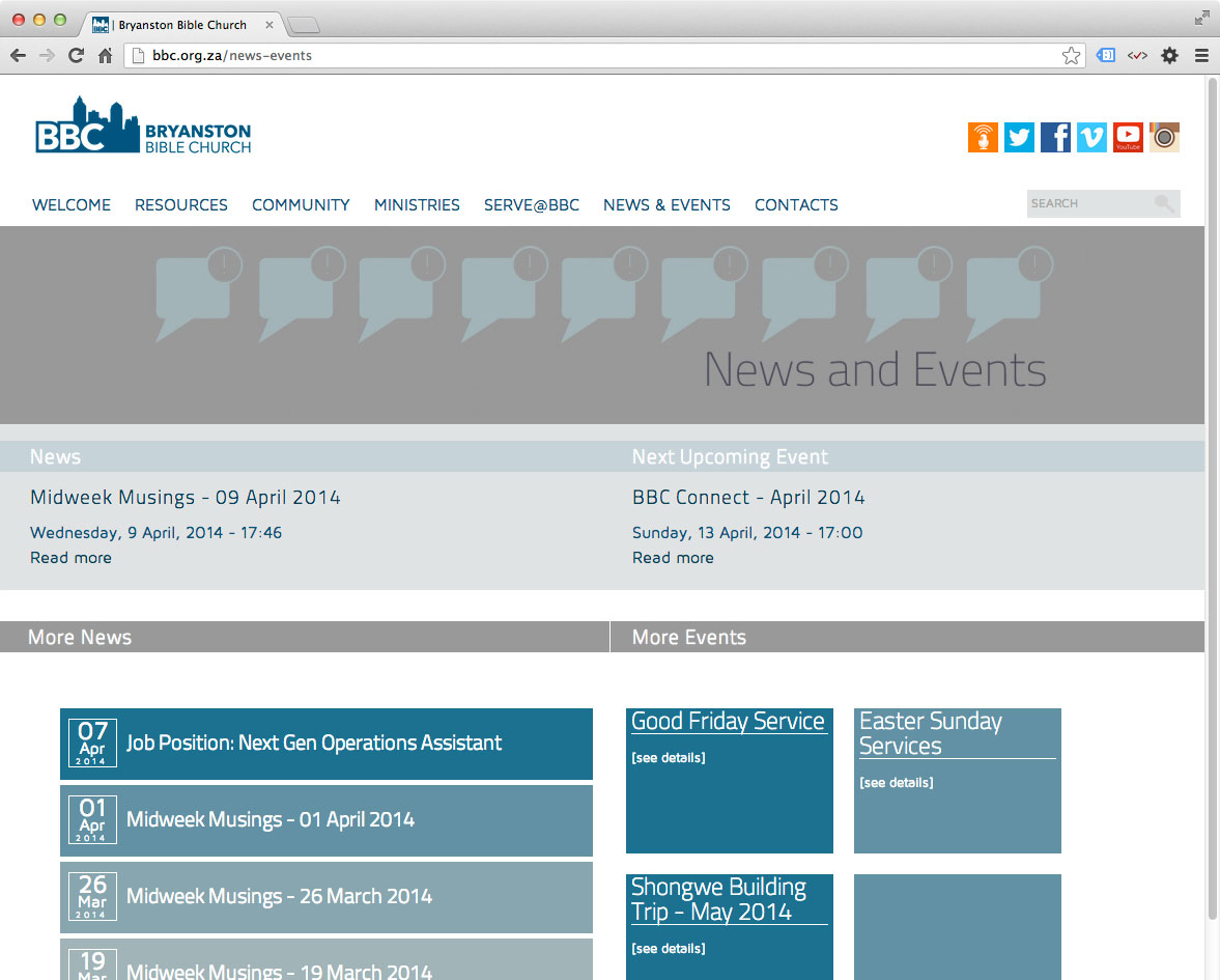
The resources section was at the centre of the site's refresh, being the most visited section of the site.
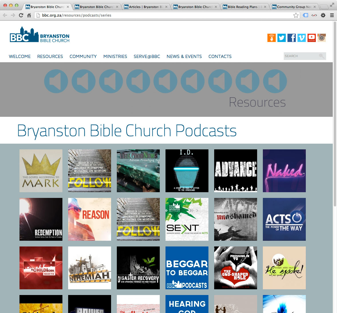
In this section, we present clear access to the newest content, along with engaging iconic links to the different types of content - audio, video, blogs, etc. Podcasts are presented by Series, with series icons allowing visitors to browse the audio by topic.
The menu structure was drastically altered to group pages and ministries together in a more meaningful way.
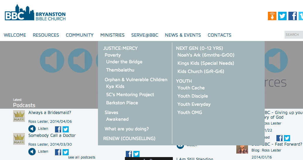
Visit the newly refreshed bbc.org.za now!
More screenshots:
