Best of 2013
Each year, we like to select some of our favorite projects from the past 12 months and give them a spotlight.
These projects reflect the ones that we enjoyed working on the most - or the ones where we simply loved the end result. We hope you like them too!
Logo of 2013: SevenC
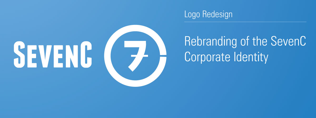
This logo has such a striking appeal to it - it has been very well received, and we feel that this logo is memorable, simple, and interesting.
Read more about this project here.
Print Design of 2013: AIRCURE "Lungs" campaign
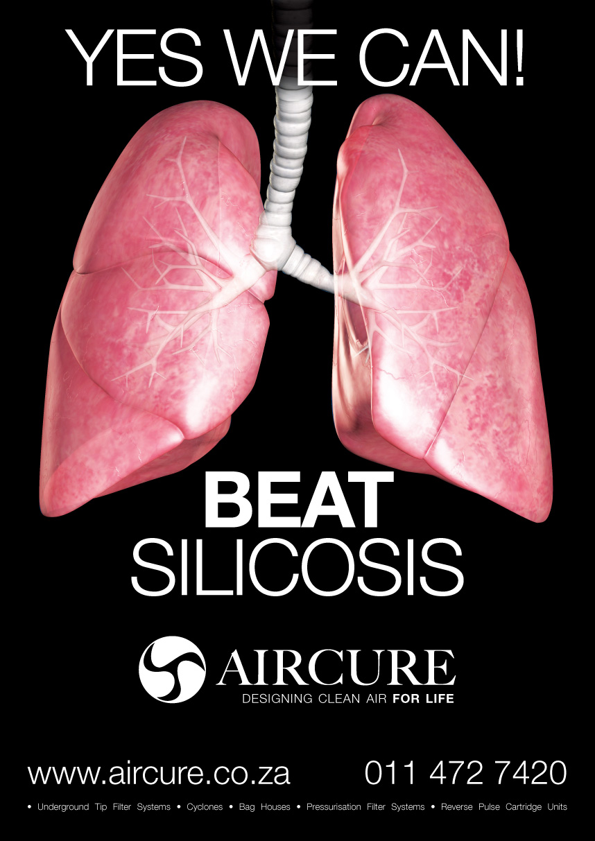
Working with Darren Bibby and the AIRCURE team is always a pleasure - it is infectious to work with people who are passionate and innovative. This campaign which saw expression as posters, T-Shirts, and magazine adverts, was striking, bold, and in-your-face; something that is not often seen in the mining industry. The product itself is revolutionary, and this concept communicated its message in a direct and striking manner.
Read more about AIRCURE "Lungs" here.
Website of 2013: Kitchen & Bedroom Gallery
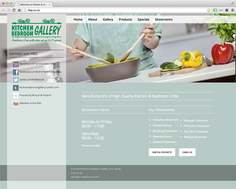
OPS has been working with The Kitchen & Bedroom Gallery website for several years, and it has been evolving and refining each year. But in 2013, the website was radically refreshed and revilalised with a brand new look.
Read more about the project here.
Best Advertising of 2013: OSRAM
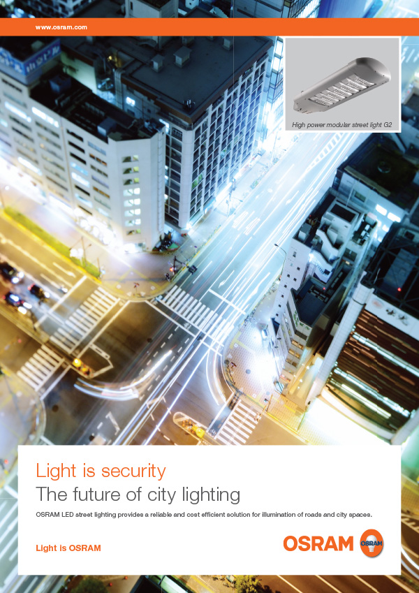
Whether we look at the fantastic TV advert for the NIGHT BREAKER product, or the all-new, completely refreshed Corporate Identity that OSRAM International has created, OSRAM is our favorite for the year. The all new CI gives the adverts a much-needed fresh and modern feel, something that is striking and beautiful.
Social Media for 2013: Kitchen & Bedroom Gallery "May Madness" campaign
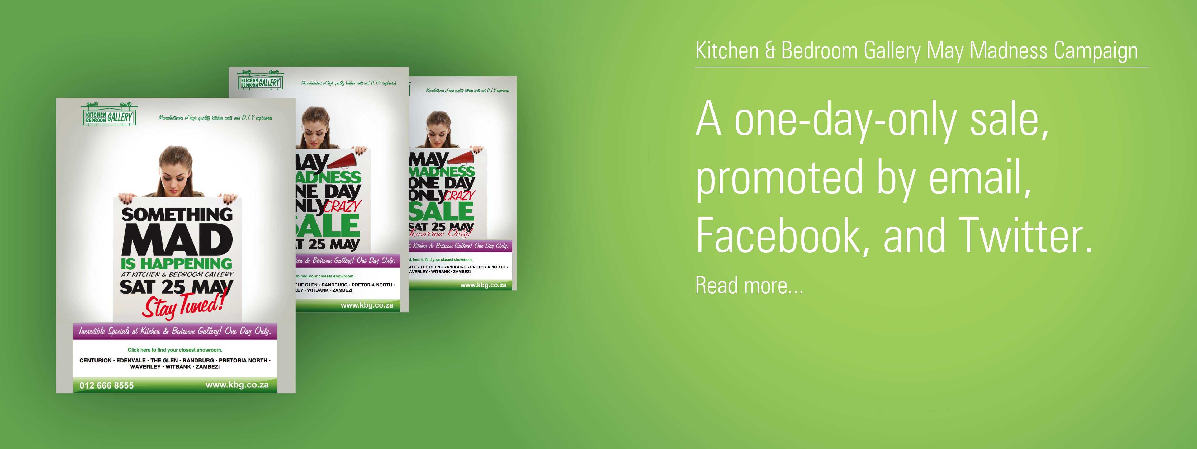
The use of Social Media can be sometimes be fruitless. Other times it can frustrate or irritate your customers. But sometimes, when it is done right, it has massive impact. That is the case for the One Day Only sale KBG ran in May. The promotion of the sale ran for a single week, online only. No traditional advertising media were used - only Email, Facebook, Tumblr, and the KBG website. The results were fantastic, but we also love the look and feel of the campaign.
Read more about it here.
We look forward to a fresh new year, and we're excited about what the year will bring. If you'd like One Part Scissors to create something spectacular for your business, call us today!
