AIRCURE 2015 Website Refresh
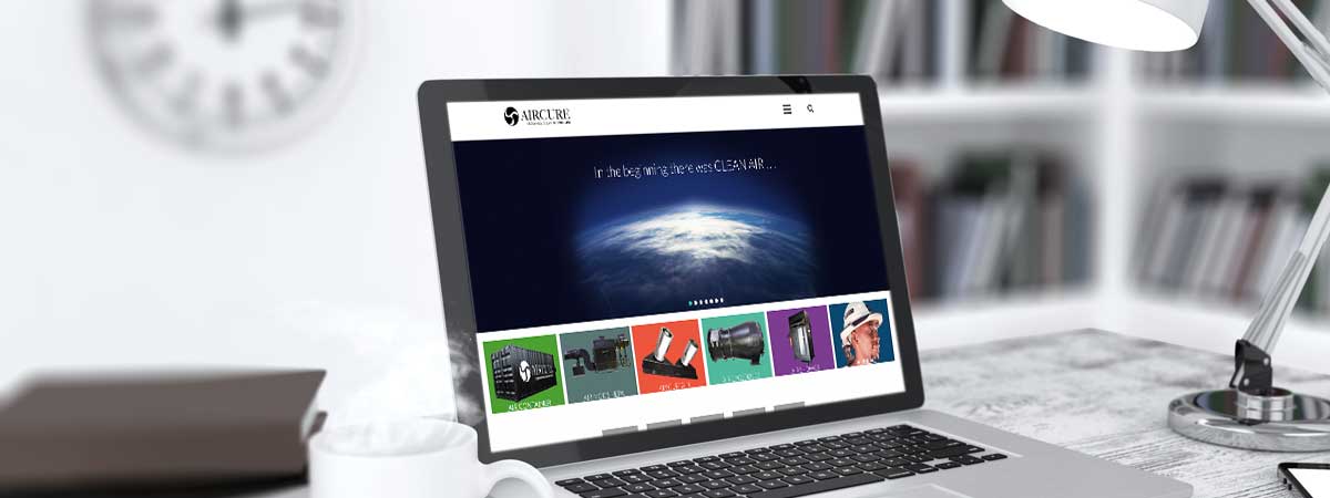
The AIRCURE range of products is innovative, exciting, and forward thinking. The website we designed a few years ago was beginning to look dated, and no longer presented Aircure accurately - it was time for a refresh.
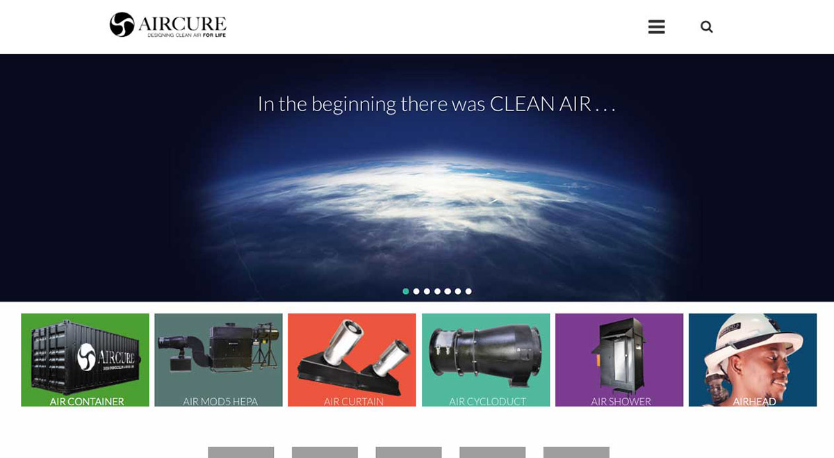
The Aircure redesign features colour for the first time with the Aircure brand. The brand has always been strongly black and white, and all the products are black.
Bright key Colours have been carefully selected to showcase the product range, and bring differentiation and identity to the range and to the individual products.
These Colours are carried across the print communication as well, to further solidify the association of colour to each product.
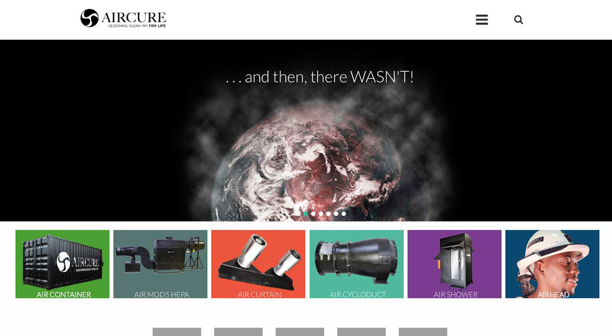
The new website is responsive, and makes use of the full width of the viewer's screen to present the strongest and most vibrant view of the brand possible. A introductory slideshow is used to tell the Aircure story and communicate what Aircure does, before introducing the current line-up of innovative products.
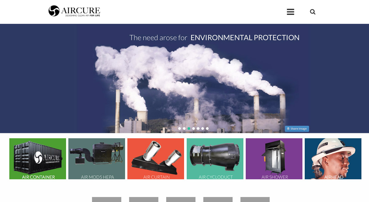
See the all-new site at aircure.co.za
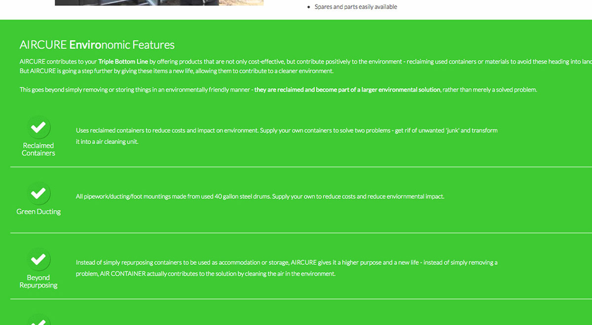
Each product page highlights the enironmental benefits of the product.
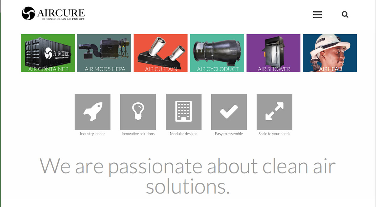
Product tiles on the homepage give direct access to videos and info straight from the home page.
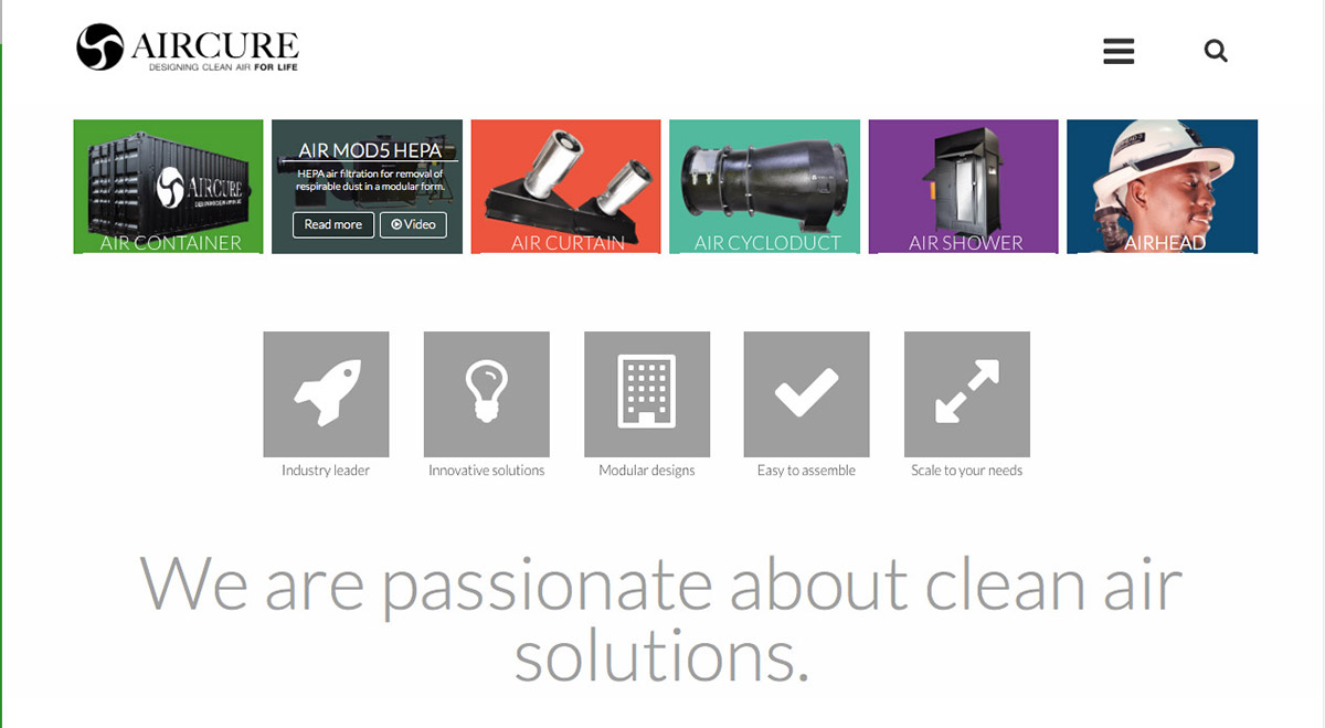
Hovering over the product reveals the video and other links.
- Log in to post comments
