Web Design Trends into 2013
Web Design trends and fashions are difficult to predict, with everything from popular culture and other disciplines of design, to major websites and software design influencing the trends. On researching the landscape, we believe that two opposing trends will emerge in web design over the next year or two. The prevailing style on the Internet for the past two or three years has been called the Web 2.0 style, with shiny, glossy buttons and smooth, gradient finishes making websites appear to have been built using glass, water, and reflective metals. The inspiration for this trend seems to have been the design of Apple's Aqua themed OS X Operating System (See example from Wikipedia). There has been a trend away from the very clean, shiny appearance of the Web 2.0 style, with websites employing real-word textures to create a more gritty appearance. This foreshadows what we believe is the first major trend: skeuomorphism.
Trend #1: Skeuomorphism

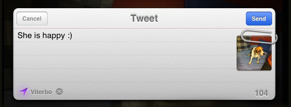
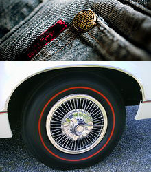
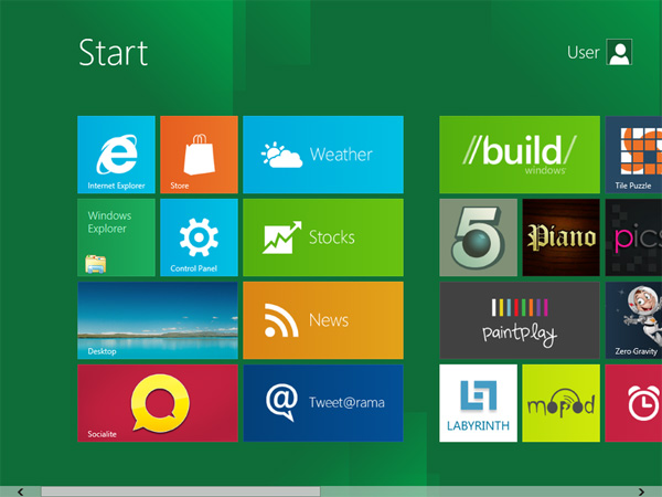
Pronounced "Skew-a-morf", this is a complicated word for a simple idea - making things look like other things. The idea has been around for a long time -  Wikipedia lists two great examples; a hubcap which appears to have spokes, and decorative rivets on jeans - neither are functional, but they represent something from an earlier time. The spokes on the hubcap are not needed as they were on the first wheels - but it appeals to us nonetheless. Skeuomorphs have been used on computers for ages - the folders on your computer are made to look like little cardboard folders - and this works, even though we all have plenty of computer folders, and probably no paper folders anymore - the metaphor still works. It is comforting. Skeuomorphics are at the heart of Apple's new design ethos. On the iPhone and iPad, the calendar is made to look like a real-world, leather-bound desk calendar. Selecting a time for your alarm clock brings up an old-style rotating dial with numbers on it. This style is being carried further into the operating system with each new version. Microsoft is about to launch their next version of Windows. Windows 8 uses an interface Microsoft is calling Metro. Their design language is starkly different from Apple's - they believe that Skeuomorphs add clutter and make things more complicated, and so they have gone for a style they're calling "Authentically Digital", and we believe this will be the second major trend.
Trend #2: "Authentically Digital"

The Authentically Digital idea in Windows 8 makes use of blocks of flat, bright colour tiles to represent the various programs. These are not representations of real world items - they're not "buttons" or "windows" or "tiles" - they are digital elements that can only exist on the computer. This look is bold, fluid, and must be used in conjunction with motion to keep it interesting - the actual elements are very plain, but they move fluidly when clicked to provide the user with feedback and guidance as to what is happening.
Why will two Operating Systems set trends in web design?
The reason we feel that these two OS trends will influence design on the web is that people look at their screens on a daily basis and interact with their computers in these two ways. This begins to form a set of expectations from users - if i see something that looks like a real-world dial, i expect to be able to click and drag it and interact with it as though it were real. If confronted with a page of large, colourful blocks, i will know these are active links. The style you decide to go for on your next website will be determined by 2 things:
- Your Brand's personality. One of these two styles is going to feel more 'right' for your brand. Your Brand's personality and style is the most important factor, it should come before personal preference!
- Your Preference. Which of these appeals to you more?
If you would like to explore a redesign of your website to make it "Skeuomorphic" or more "Authentically Digital", let us know and we will arrange to come and see you.
