GodFirst Corporate Identity

One Part Scissors has refreshed the brand of GodFirst Church. GodFirst is going through a rebranding process to strengthen the brand for the exciting changes the church has lined up for 2010. GodFirst is expanding to operate in 7 locations in the new year, and the larger scale of the group means that a defined and structured set of guidelines around the presentation of the brand becomes vital.
Because of GodFirst's growing profile in the city, OPS created a new logo that pays homage to the former logo, so as to maintain recognition and credibility - the ties to the old identity are still strong, but the logo has been updated, strengthened and refreshed.
 New GodFirst Logo. The new refreshed logo has thicker lines, which allows it to be legible at much smaller sizes than the previous logo. |
 Previous GodFirst Logo. Previous GodFirst Logo. |
|
A symbol was also devised for situations where the full logo cannot be used – for example, as the Website's "Favorite Icon". The symbol makes use of the phrase "G1", which has become a colloquial reference to the church among its members. |
|
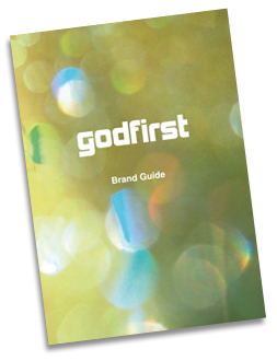
Brand Manual
 |
The GodFirst brand identity manual was given to all those responsible for communicating on behalf of the church. The guidelines in the corporate identity manual are loose enough to allow for creative expression around the themes that the church communicates about - everything from marriage and sex, to salvation and destiny.The brand manual seeks to provide a framework that is dynamic and adaptable. |
- Log in to post comments

