About Responsive Web Design

There are two aspects to web design - technology and design. With web design, the visual aspect can be influenced by such varied influences as operating system and software design, to traditional design such a brochure or poster design.
As far as technology goes, new technologies are always emerging, and it is important to take advantage of the benefits afforded by these new technologies and techniques.
A major influence to the Internet has been the rise of mobile devices such as tablets and smartphones. People have more regular and immediate access to the Internet, and these devices have also brought the Internet to millions of people who have not previously had access (this is particularly true in Africa).
The limitations of these devices are twofold - they have smaller screens, and they normally have a touch screen as their primary source of input.
As far as "Touchscreen as Input" goes, this means that 'hover' states cannot be counted on to be seen by your visitors - very often when you slide over something with your mouse cursor, it will light up or give you visual feedback to let you know it is clickable. There is no 'hover' state when you tap a screen to click - and there is no hovering or mousing over. This impacts the way a website needs to look - links need to look like links without depending on the mouse over effect.
By far the biggest impact these smaller devices have on your website is the size of the screen. iPads and iPhones will generally display a website as it appears on your desktop screen, but text will often be tiny and unreadable - double-tap an area to zoom in and read. This works, but it doesn't make for a very fluid browsing experience.
What you need, of course, is your content to be a single column that fills the width of the small screen, with text that is readable at arms length. Two columns of text don't sit well on a tiny screen.
This presents a dilemma though - if you go with a single column layout on a desktop-sized screen, the website will feel... boring. It will not be making the best use of the bigger screen.
Initially, the idea was to have a "Mobi" site, and a desktop site. This becomes a pain to administer though - you now have 2 websites to keep up to date.
Enter the concept of "Responsive" web design.
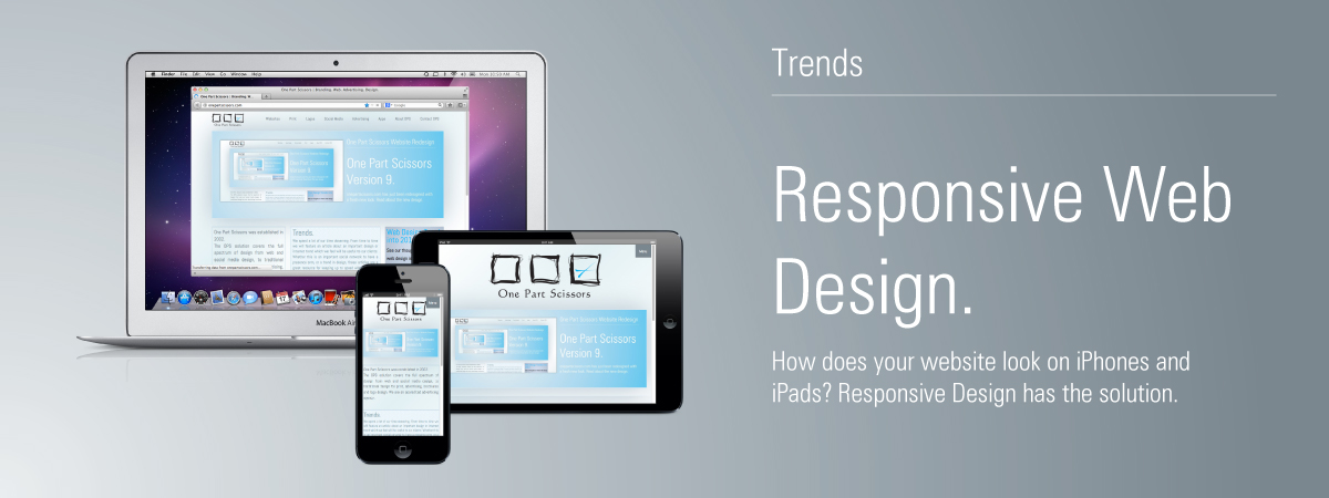
Quite simply, "Responsive" means that your website responds to the screen it is being displayed on. You have one website, but it displays completely differently on a desktop or a mobile device.
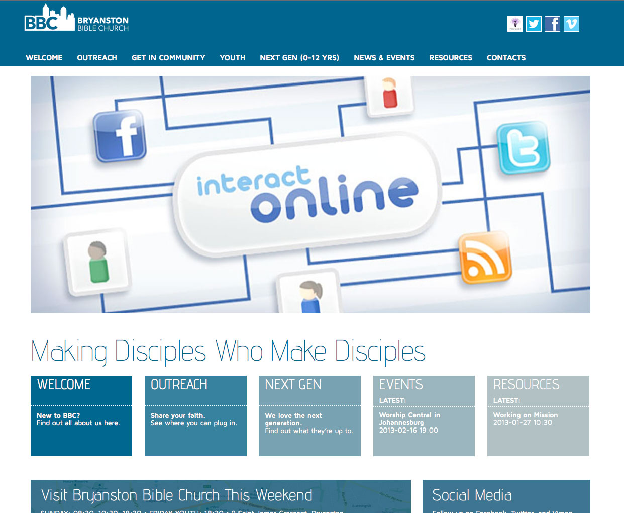
See below, we show screenshots from the new Responsive Bryanston Bible Church website (visit the site on your computer and mobile device to see it in action - bbc.org.za).
First up, we see the homepage of the bbc.org.za website on a computer:

We have taken full advantage of the large screen size, by having an interesting multi-coumn layout that presents the visitor with all the info they need.
However, if this was presented on a mobile device as-is, it would be quite useless. See the image below for example - this is 320 pixels across, the same size as an iPhone screen.

As we can see, the text is far too small to read, the main menu links are tiny, which is problematic because a finger will not be able to tap these links easily. Below, see how the website is displayed on a mobile device.

For the mobile view of the website, we have increased the size of the logo to make it more visible. We have presented the social network icons below the logo, and we have packed the menu away inside a tappable menu box. This allows the menu links to be easily accessible, but not taking up valuable screen real estate when not in use.
Below the header area, we have the many columns of content sorted into a single column that is readable and useful.
Having a responsive website in today's age is vital. Mobile devices and tablets are beginning to outsell traditional computers, and this trend is set to continue and deepen. Having your content available at a single destination - but magically displaying perfectly on everyone's devices - is a requirement in today's multi-device, multi-screen world.
If you would like to have your website refreshed and made responsive, click here to contact One Part Scissors to discuss your website.
