andrewbrough.com

Andrew Brough Communications

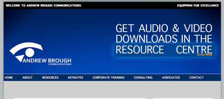
One Part Scissors has updated the website for Andrew Brough Communications. The new website has a strong resource and interactivity focus, with podcasts, video podcasts and blog-style stories being regularly updated through the content management system.

The Resource Centre is packed with interesting information is a variety of media, and there is a Member's Zone which allows Andy to share special content with paying clients. We took our lead for the look and feel of the website from the previous website and the Brand Standards Guide we created for Andrew Brough in 2008, but the look has been updated with drop shadows and layered graphics that add a three dimensional feel.

See the new site at andrewbrough.com

(Meta)Canonical URL: 

Although we ensure the websites we build for our clients are compatible with all browsers, we like to push the envelope on our own website. So we've made the decision to make use of a design that looks amazing in all browsers... except Internet Explorer. If you're still using IE, you need to change - the web has moved on from Internet Explorer, and you will get a safer, faster, and more enjoyable experience out of the Internet if you use anything other than IE. Have a look at BrowseHappy.com to choose a new browser. We recommend Google Chrome and Firefox.

(PS: Microsoft is working on a new web browser, and we're all holding thumbs that it will follow the web standards and display the web like everyone else does... correctly.)